Interactive physics and fluid movement in web experiences
Motion is the new typography. When elements inherit weight, friction and momentum, the interface stops feeling like a page and starts feeling like a place.
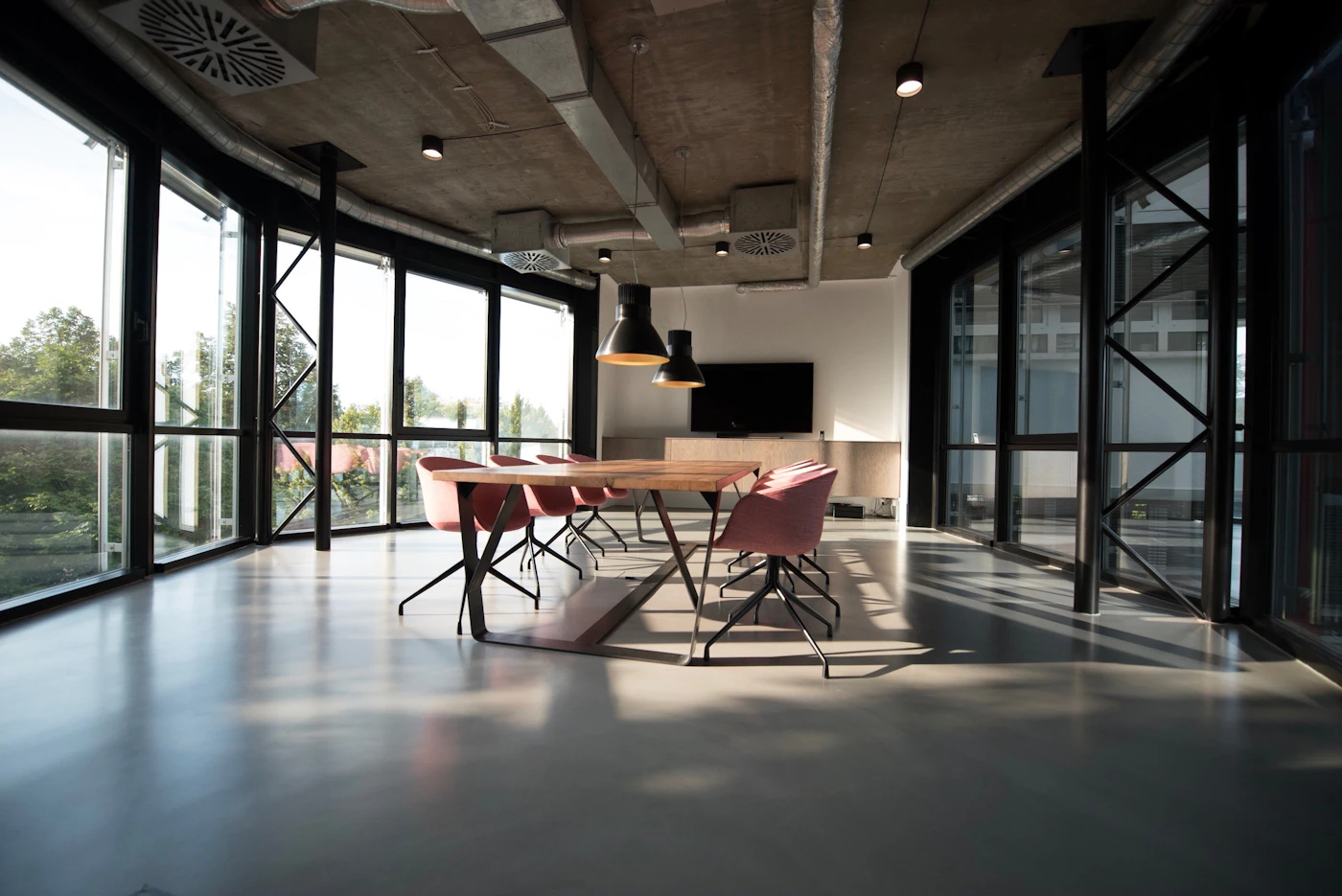
An interface that moves like the real world earns trust without asking for it. Physics is a language users already speak, inherited from every object they have ever pushed. Borrow it, and interaction stops needing instructions.
Give every element a weight
A button should feel heavier than a label. A card should settle with the ease of something that found its place, not snap like a window being forced shut. Easing curves are the emotional palette of interaction design, and most interfaces use exactly one of them.
If you change only one thing, change the easing. It is the difference between a door and a portal.
— On the craft of motion
Duration is a voice
Long durations feel luxurious, short ones feel urgent. Neither is right or wrong, but both are choices. Pick a duration that matches the weight of the element and the mood of the moment, then stay consistent enough that the interface develops a personality.
Friction makes it feel real
Nothing in the physical world stops instantly. A little friction, a little overshoot on the way to rest, and elements stop feeling like CSS and start feeling like objects. The difference is subtle and it is everything.
Scroll as a conductor, not an enemy
The scroll position is the most natural timeline on the web. Anchoring motion to it, scrubbing scenes, drifting layers at different depths, turns a page into a sequence the user conducts with their own hand. Nothing else on the web feels quite as direct.
| Layer | Speed | Effect |
|---|---|---|
| Foreground | 1.0x | Content, precise |
| Midground | 0.6x | Subtle drift |
| Background | 0.2x | Deep parallax |

Motion is the new typography.
- Layer parallax by depth, not by effect
- Scrub what scrolls, spring what hovers
- Respect reduced motion like an accessibility law
- Ease out, never ease in
Respect the quiet
Motion is a spotlight. Use it on the thing you want noticed and leave the rest still. The most kinetic sites on the web are the ones that know when to hold still.
Start small. Give one element real weight, let it settle with proper easing, and watch users touch it twice. That is the moment an interface stops being looked at and starts being used.